Self-Initiated Packaging Concept
From Brand Concept to Production
Creating an original sparkling water brand and carrying the design system through the technical details of packaging production.

Fizz sparkling flavored water family across individual bottles and a 24-bottle variety case.
ROLE + TOOLS
• Brand concept, packaging design and production adaptation
• Tools: Adobe Illustrator, Adobe Photoshop, AI-assisted visualization
DELIVERABLES
• Conceptual artwork for three bottle labels and 24-bottle case
• Flat production artwork for review + print-ready files
• Final digital mockups

01 / OVERVIEW
Project Overview
I developed Fizz as a self-initiated packaging concept to demonstrate how I approach both the creative and technical sides of packaging. The family includes Lemon, Strawberry and Blueberry across individual bottle labels and a 24-bottle variety case.
02 / CREATIVE DIRECTION
Design Goal
The visual direction needed to feel bright, simple and easy to navigate at shelf. A consistent logo, typography hierarchy and oversized fruit illustrations connect the three SKUs, while a distinct color gives each flavor its own identity.
03 / DESIGN SYSTEM
BUILDING A SCALABLE FLAVOR FAMILY
One master structure establishes consistent logo placement, typography, flavor hierarchy and regulatory information, while color and fruit imagery change by SKU. I designed the system with packaging production in mind so it could scale across pack sizes, flavor assortments, dielines and bottle formats.


One master label system adapted across Lemon, Strawberry and Blueberry.

05 / PRIMARY PACKAGING
Pressure-Sensitive Bottle Labels
The labels were planned as surface-printed pressure-sensitive labels on white poly film. The opaque substrate supports bright flavor colors and keeps the artwork readable against the lightly tinted liquids without requiring a separate white-ink station. This also reduces the number of ink stations required during production.
• White poly film, surface printed
• Flexographic printing
• Maximum of eight ink stations
• Black flavor names set to overprint
06 / SECONDARY PACKAGING
Shrink-Wrapped Variety Case
The 24-bottle variety case extends the same visual system onto clear poly shrink film. The logo, product description, pack count and flavor breakdown are prioritized for quick recognition.
• Clear poly film, reverse printed
• Two hits of white ink specified beneath printed elements to support opacity and color brightness
• Maximum of ten ink stations, including whites

07 / FLAT ARTWORK
Mapping the case artwork
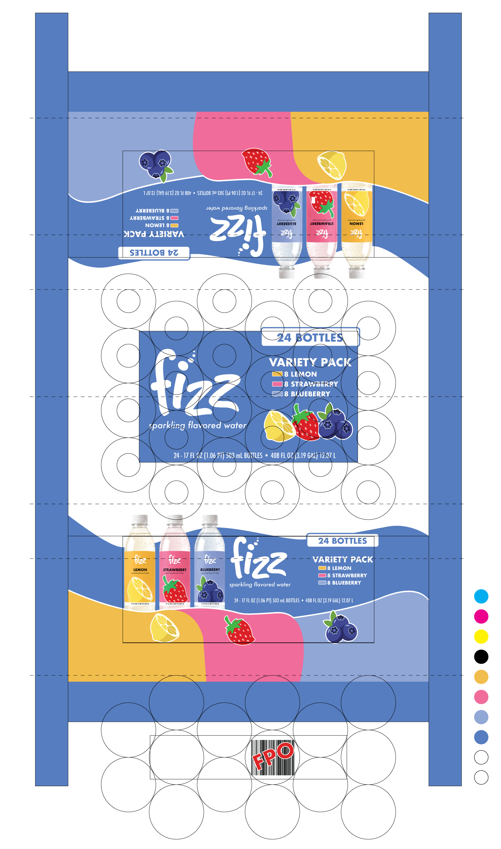
Primary messaging is assigned to the front-facing panels, while simplified color and brand elements continue across the top, back and seam areas. Critical copy remains within lower-distortion zones and away from folds, seams and bottle-contact areas.
• Folds, seams and bottle-contact areas mapped before final artwork placement
• Two hits of white ink specified beneath printed colors for opacity
• Maximum of ten ink stations, including two white stations
• Core brand colors specified as Pantone spot colors; supporting colors converted to CMYK/process builds to remain within the press limit
• Strategic white keylines used to manage trapping while preserving the intended design